
Important CSS properties that are very handy.
We will discuss each property with a practical example. You can try them by understanding the code and concept. Let's learn them.


There are some hidden properties that can save us lots of time while coding. We will discuss 4 CSS properties and 1 HTML entity.
1. Inline-flex
Let us understand this property by taking an example.
we have a <p> tag and inside this <p> tag we have a <span> element with a "badge" class.
What we want is to make the "badge" class a circle and the text within it i.e '6' to be in the perfect center.
<p>Comments <span class="badge">6</p>
Let us write the CSS for the badge.
.badge {
width: 30px;
height: 30px;
border-radius: 50%;
background-color: RGB(48, 209, 88);
color: white;
}
At this point, the output is not what we want this is due to the inline span element.
we can think of inline-flex at this point.
What is an inline-flex?
- It makes the flex container itself behave like an inline element instead of a block element.
- All the properties of flex apply to inline-flex.
Now we can make this span element an inline-flex element.
.badge {
  width: 30px;
  height: 30px;
  border-radius: 50%;
  background-color: RGB(48, 209, 88);
  color: white;
  display: inline-flex;
  align-items: center;
  justify-content: center;
}
🚀 The final output will be -

2. Align-self
Let us understand this property by designing a simple card.
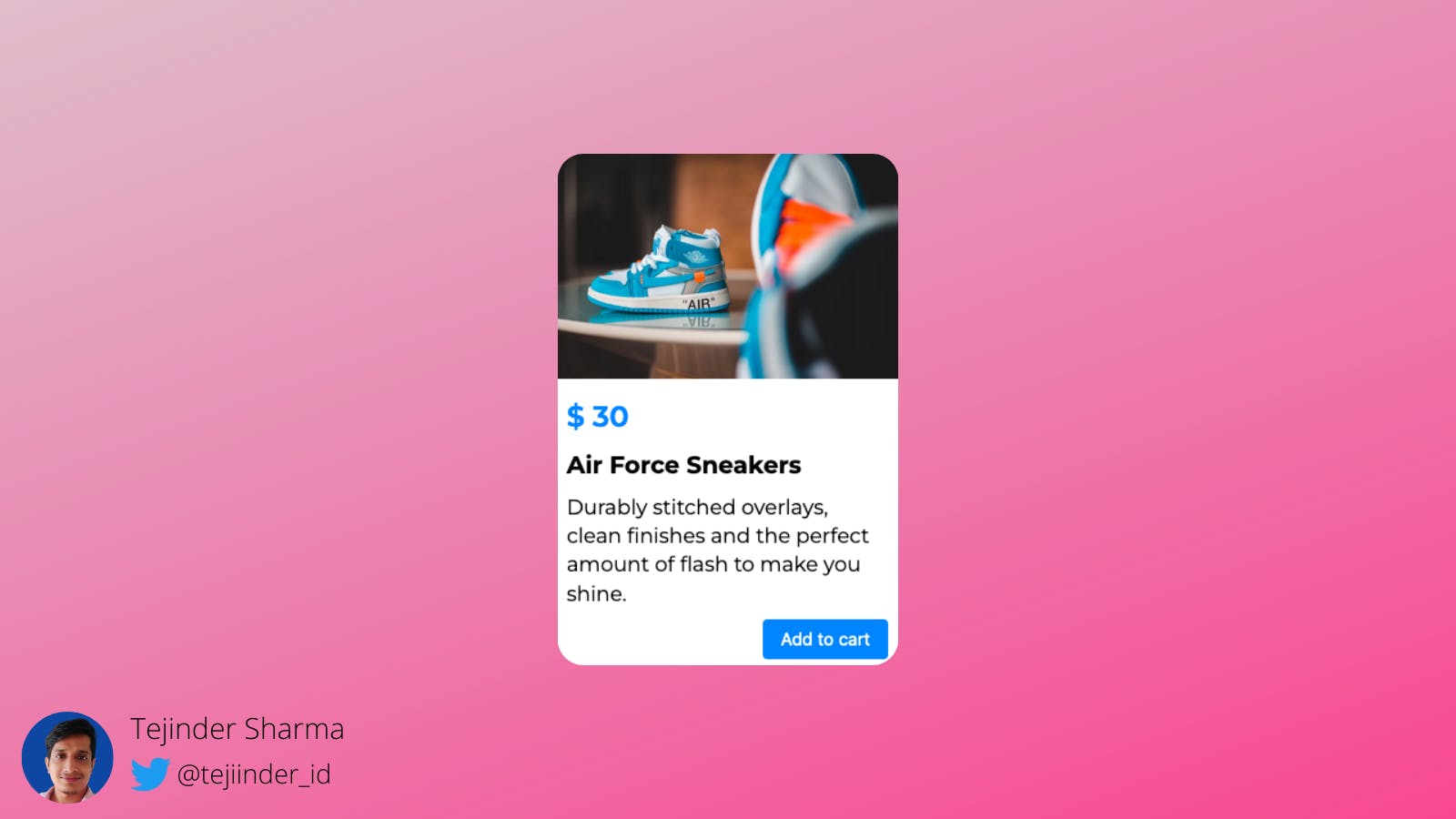
The HTML part for the card will be -
 <div class="card">
        <img src="https://images.pexels.com/photos/8381335/pexels-photo-8381335.jpeg?auto=compress&cs=tinysrgb&w=1260&h=750&dpr=2" alt="">
        <div class="description">
            <span class="price">$ 50</span>
            <h3>Air Force Sneakers</h3>
            <p> Durably stitched overlays, clean finishes and the perfect amount of flash to make you shine.
            </p>
            <button>Add to cart</button>
       </div>
 </div>
Let us write the CSS part -
* {
  padding: 0;
  margin: 0;
  box-sizing: border-box;
}
.card {
  font-size: 18px;
  background: #fff;
  border-radius: 15px;
}
.card img {
  display: block;
  width: 100%;
  height: 150px;
  object-fit: cover;
  border-radius: 15px 15px 0 0;
}
.description {
  padding: 0.8rem;
  display: flex;
  flex-direction: column;
}
.price {
  display: block;
  margin-top: 15px;
  font-weight: 600;
  color: #0891b2;
  font-size: 1.4rem;
}
h3 {
  margin: 10px 0 0;
}
p {
  margin: 10px 0 0;
}
button {
  margin-top: 10px;
  padding: 8px 16px;
  border: none;
  background-color: #0891b2;
  color: #fff;
  border-radius: 4px;
  cursor: pointer;
}
Till this point the output will look like this:-
From the output, we can clearly see that the button is taking the full width but we want the button to be aligned to the right side and take as much width as is necessary.
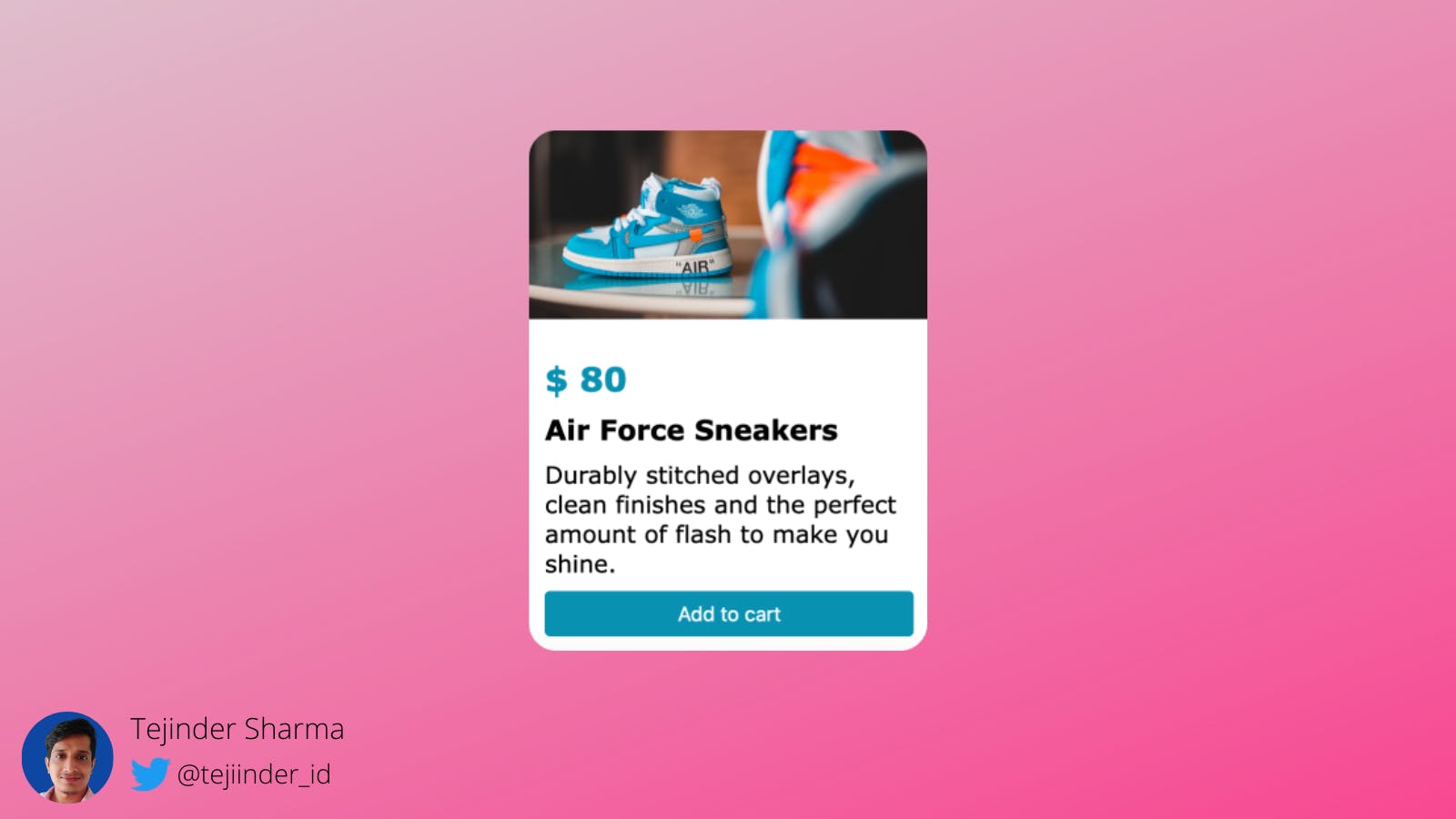
😀 Thankfully we have the align-self property of flex.
what is the align-self property?
- The property
align-selffor a flex item is similar to thealign-itemsproperty. - The
align-selfproperty specifies the alignment for the selected item inside the flexible container. - whereas
align-itemsapplies to all the items in the flexible container.The
align-selfproperty overrides the flexible container's align-items property.
The align-self values are also similar to align-items.
stretch
- Stretch 'auto'-sized items to fit the container. This is the default value that will be applied.
center
- Put the item around the center.
flex-start
- Put the flex item at the start.
flex-end
- Put the flex item at the end.
🚀 Now we will choose the desired property that we want. As we want the button to be on
the right side of the card so we choose align-self: flex-end and we get the desired result.
3. Outline Property
This is a simple and useful property. We can use this property in many ways like debugging the CSS code but one of the uses of this property is to make an outline border around an image.
Let us understand it with an example. Below is the image with the border, we will make this border with the outline property.

First, we will write an HTML code:-
<img src="https://www.w3schools.com/howto/img_avatar.png" alt="profile-pic">
Let us write the CSS code:-
img{
width: 60px;
height: 60px;
border-radius: 50%;

border: 2px solid transparent;
outline: 2px solid #1da1f2;
}
🚀 That is one of the uses of outline property.
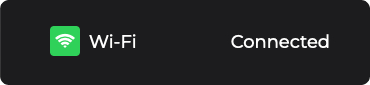
4. Margin: auto
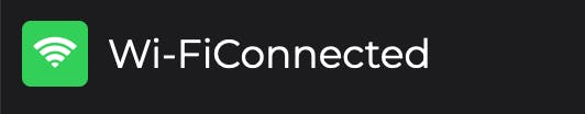
Let us understand this property by taking an example of notification design.

See the Connected text in the above image, It is on the left side and there is a gap between the "Wi-Fi" text and the "Connected" text.
How this can be achieved?
Let's first make the HTML structure for this design.
<div class="container">
  <span class="icon"><i class="fa fa-wifi"></i></span>
  <span class="name">Wi-Fi</span>
  <span class="status">Connected</span>
</div>
We are using the font awesome icons so don't forget to paste the below link in the
headtag of your HTML.
<link rel="stylesheet" href="https://cdnjs.cloudflare.com/ajax/libs/font-awesome/4.7.0/css/font-awesome.min.css">
Let's write the CSS for the design.
import url("https://fonts.googleapis.com/css2?family=Montserrat:wght@400;500;600;700&display=swap");

/* Basic Resettings */

* {
  margin: 0;
  padding: 0;
  box-sizing: border-box;
}

body {
  font-family: "Montserrat", sans-serif;
  background-color: #1c1c1e;
}

.container {
  display: flex;
  max-width: 300px;
  width: 100%;
  padding: 10px;
  align-items: center;
  background-color: #1c1c1e;
  color: #fff;
}

.icon {
  width: 30px;
  height: 30px;

  display: flex;
  justify-content: center;
  align-items: center;

  background-color: #30d158;
  color: #fff;
  border-radius: 4px;
}

.name {
  margin-left: 0.5rem;
}
We are using google fonts i.e "Montserrat".
Up to this point, the output is not desired what we want. The output is 👇
We can see no gap b/w the "Wi-Fi" and "Connected" text and we want the "Connected" text on the extreme right side of the "container".
Then how to achieve this ?🤔
The one property that comes to mind is the margin property.
margin
- The CSS margin properties are used to create space around elements, outside of any defined borders.
In the above case, we want the margin-left property to create space on the left of the "Connected" text.
margin-left: automeans that all the extra space left to the element will be covered by the left margin thus pushing the element to the right.
Let's write our leftover CSS code.
.status {
  margin-left: auto;
}
🚀 Now we got the desired output.
5. Use of HTML entity name in HTML
We can use the HTML entity names in HTML then we can design those entities in CSS.
For example, If we want to display a "star" symbol within a website then we can use an HTML entity source Code i.e ★ for the star.
Let's discuss it by taking an example.
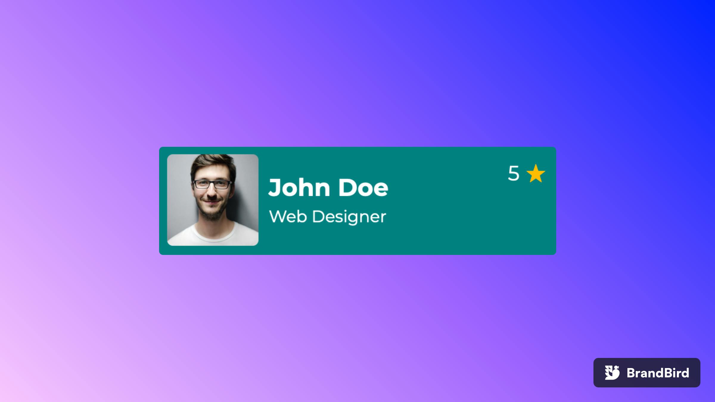
We are going to design the below profile card 👇
Let's make an HTML structure for this design.
<div class="container">
<img src="https://images.pexels.com/photos/220453/pexels-photo-220453.jpeg?auto=compress&cs=tinysrgb&w=1260&h=750&dpr=2"
alt="">
<div class="position">
<h3 class="name">John Doe</h3>
<span class="role">Web Designer</span>
</div>
<div class="rating">5 <span class="star">★</span></div>
</div>
In the above example, we have used the HTML entity name i.e ★ instead of an icon.
Let's make the CSS for this design.
@import url("https://fonts.googleapis.com/css2?family=Montserrat:wght@400;500;600;700&display=swap");

        * {
            margin: 0;
            padding: 0;
            box-sizing: border-box;
        }
        body {
            font-family: "Montserrat", sans-serif;
        }
        .container {
            max-width: 350px;
            width: 80%;
            margin: 1rem auto;

            display: flex;
            align-items: center;

            padding: 0.5rem;
            background-color: teal;
            color: white;
            border-radius: 5px;
        }
        img {
            width: 80px;
            height: 80px;

            object-fit: cover;
            border-radius: 5px;
        }
        .rating {
            margin-left: auto;
            align-self: flex-start;
        }
        .star {
            font-size: 1.2rem;
            color: #FFBC08;
        }
        .position {
            margin-left: 0.5rem;
        }
        .role {
            font-size: 0.8rem;
        }
From the above code, we can clearly see that we have designed that HTML entity in CSS.
   .star {
            font-size: 1.2rem;
            color: #FFBC08;
        }
We can refer to more HTML entities at https://www.html.am/html-codes/character-codes
🚀 We have successfully covered HTML entities.
That's all about this article.😀
If you enjoyed this article and want to see more content about development, design, creativity, and learning, then follow me on
- Twitter https://twitter.com/tejinder_id
- See my work at Codepen https://codepen.io/tejinder01
- Github https://github.com/tejinder-sharma
- Hash node @Tejinder
If you'd like to support me to make more content, check out my BuyMeACoffee page.